Thursday, July 18, 2013

Mapping Historical Votes: When Women's Suffrage Failed, 1915.

With the release of the amazing new historical Congressional shapefiles (by Jeffrey B. Lewis, Brandon Devine, Lincoln Pritcher, and the invaluable Congressional geographer Kenneth Martis), along with the great work of sites like Govtrack, we can fairly easily map any historical vote.

I thought I'd demonstrate this with a vote that has long interested me: the failed vote on a women's suffrage amendment in the 63rd Congress (1913-1915).  

Here's the map, colored by party as you'd expect (red is Republican, blue is Democratic), with yellow for Progressives, and green for the sole independent, California's William Kent (who may or may not have been a Progressive for this vote).  Following Martis' maps, I've added insets for urban areas.
  
The darkest colors are "aye", the lighter colors are "nay", and the lightest colors are unrecorded votes ("Not Voting", vacancies, or not listed by Govtrack at all).


Note that this was before "one man one vote", so quite a few states had one or more at-large Representatives.  Since these can't all be mapped, I've listed those votes on the bottom right.

Some regional patterns are immediately clear:
  • The South, and Southern Democrats more specifically, was almost monolithic in its opposition to the suffrage amendment.  Of "Deep South" Congressmen, only Alabama's Richmond Hobson voted Aye (although he had lost a primary for his next term already).

    Even in border states, most of the Aye votes came from Republicans in Eastern Tennessee, Western Virginia, Kentucky, and West Virginia.  I believe the only exceptions are the two Memphis-area Democrats, future Senator Kenneth McKellar and Thetus Sims.
  • The West--Democrats, Republicans, Independents, and Progressives--was even more monolithic in its support of the suffrage amendment.  Only one Western Congressman, Colorado Democrat George Kindel, voted against the suffrage amendment, and there were scarcely even any missed votes.  Many of these states, of course, already allowed women to vote.

    (Incidentally, the two Los Angeles County Congressmen, Charles Bell and future Governor William Stephens, identified as Progressives at points in their careers, but GovTrack has them listed as Republicans for this vote.  Bell, who incidentally helped pass California's suffrage act, had been re-elected as a Progressive, but this was still his "Republican" term.  You might notice California's partisan geography is the inverse of today's, with coastal districts Republican or independent, and inland districts Democratic).

    Oddly enough, Kindel had retired from the House to run for Senate--on the "Kindel Commercial Equality" ticket.  He wound up behind the Socialist, with 4.5% of the vote.

  • Cities were generally against the suffrage amendment, although there are some nuances:
    • The Congressmen from New York City, Detroit, Cleveland, St. Louis, Detroit, Baltimore, Milwaukee, Newark, Cincinnati, Indianapolis, Rochester, Columbus, and St. Paul were nearly all against suffrage.  They were also nearly all Democrats.  By the way, note the incredible number of districts mostly or entirely on Manhattan--about 12.

      The two Manhattan Congressmen who voted Aye were Progressive Walter Chandler and Democrat Henry George Jr., the son of the famous "Single Tax" advocate.  Both had Harlem-area disricts, with George's extending into the Bronx.  Brooklyn's Herman Metz (another lame duck) and James Maher (representing what we now think of as Downtown Brooklyn) supported the amendment as well.

      Cleveland Democrat Robert Crosser voted for the suffrage amendment as an at-Large Representative from Ohio, and Baltimore Democrat Frank Smith (a lame duck by the time of this vote) also supported the amendment.  And of course, the representatives from Southern cities (New Orleans and Louisville were the largest urban areas in the South at the time) opposed women's suffrage as well.
    • Congressmen from Philadelphia, Boston, Pittsburgh, Buffalo, and Providence were split (Boston was only split in the sense that the central Boston Congressmen don't seem to have voted at all).

      I find Philadelphia's split particularly interesting, with Broad Street serving as the apparent dividing line.  Broadly speaking, my sense (from, e.g., the great book "Tasting Freedom") is that Western Philadelphia has generally had more "reform" politicians, and Eastern Philadelphia has generally had more "machine" politicians, although archetypal Philly machine boss William Vare voted for this amendment.  Incidentally, the city's sole anti-suffrage Republican, J. Hampton Moore, would go on to be Mayor.

      I also don't know what on Earth is going on with Providence, which might be split into as many as three districts, but Rhode Island Democrat George O'Shaunessy supported the suffrage amendment.
    • Congressmen from Chicago, Minneapolis, Kansas City, Jersey City, and most Western cities (Los Angeles, San Francisco, Seattle, Portland) recorded no votes against the amendment.

      Toledo Democrat Isaac Sherwood (a Civil War veteran!) voted for the amendment, and the aforementioned George Kindel was a Denver Democrat.

      I don't know why the representatives of the entire urban area between Newark and New York City voted for suffrage when neither of those cities did themselves.

      New Haven (lame duck) Democrat Thomas Reilly voted for the suffrage amendment as well.

As I understand the scholarship, urban voters (often immigrants) and/or urban machines were often hesitant to support women's suffrage for various reasons, and perhaps especially since they feared women would vote for prohibition.  (Some writers note that women's suffrage passed relatively easily once prohibition was enacted anyway).  I don't remember which papers I'm thinking of; perhaps this one by Buenker.  Anyway, this might be part of why the representatives from northern Wisconsin and Minnesota's Iron Range opposed this suffrage amendment as well.  

With cities and the South mostly opposed, it's pretty amazing that even a third of the Democratic caucus supported this suffrage amendment.  Some political context:

You might have noticed I kept writing the phrase "lame duck".  

Democrats won the 1912 House elections in a landslide, winning 290 seats (which is.  But they lost a net total of 60 seats in the 1914 elections, keeping the House but with a greatly reduced majority.  Connecticut, for example, went from all-Democratic to all-Republican in the 1914 election, and Democrats lost 10 seats in Illinois.  

Between that enormous loss, primaries, and retirements, a great many lame ducks were voting on this amendment, so the relationship between the roll call vote and district-level public opinion on women's suffrage was probably pretty complicated.  It would be interesting to study that further.

But my main point in writing this post is to promote the use of these wonderful shapefiles in historical political science.

By the way, along with the maps, I found this PDF directory of the 63rd Congress useful in checking which Representatives lived in which cities.

Friday, July 5, 2013

Where Has New York City Changed In The Last 10 Years?

In my last two posts, I looked at demographic changes in Brooklyn, as measured by the U.S. Census or by the American Community Survey. My conclusion was that, despite some apparent misconceptions, relatively little of Brooklyn is "gentrifying"--that is, growing wealthier, whiter, and more educated.

With the same technique—using tract relationship files to combine 2000 and 2010 tracts into comparable units (throwing out currently empty polygons)--we can look at changes across New York City.  Have any neighborhoods changed like Brooklyn's Williamsburg/Park Slope nexus?  And what other kinds of changes have their been?

(By the way, I found these neighborhood maps of Queens and the Bronx useful, among others.)

Let's begin with race and ethnicity. Unfortunately, New York City is quite segregated, and with de facto racial/ethnic borders that are very close to what they were 10 years ago.  For example, the boundary of Chinatown, in lower Manhattan, is almost precisely the same in 2000 and in 2010.


While most areas have seen rather little racial or ethnic change, some areas have of course seen much more.  On a map, changing regions stand out all the more for being relatively rare and sharply limited.  

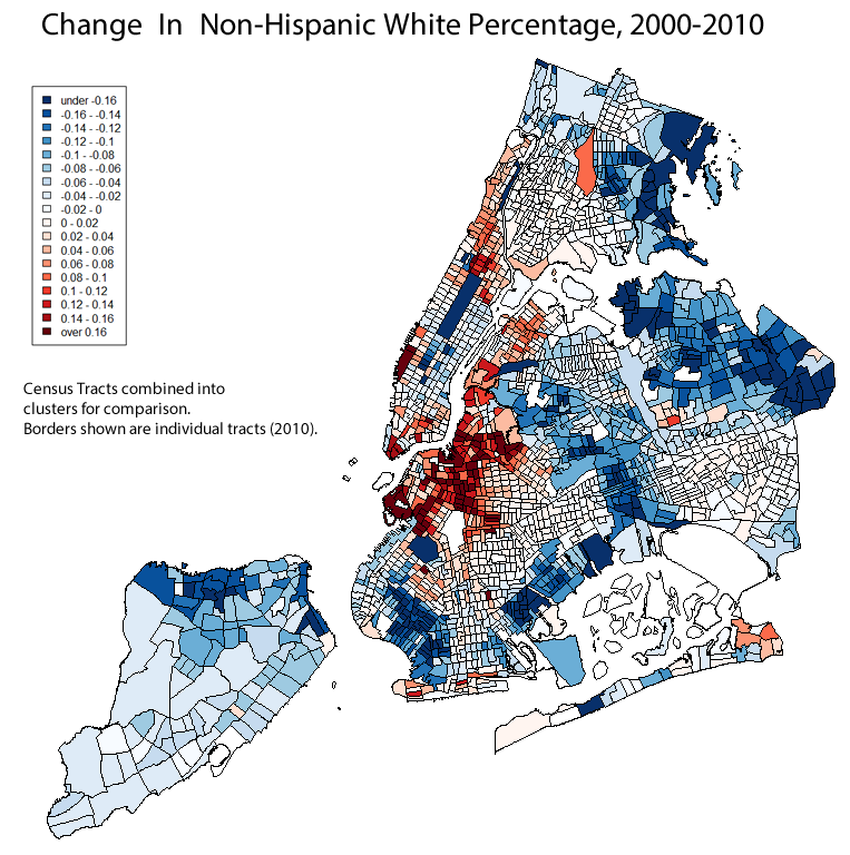
For example, here is a map of the change in non-Hispanic white population share (“blue” generally means “decrease”, in these maps):


The non-Hispanic white population share generally increased the most in that familiar Brooklyn region running from Gowanus through Prospect Heights and Williamsburg to East Bushwick. 

There was some increase in Harlem, especially in South Harlem, in Hudson Yards, and in Battery Park, and what seems to be a smaller increase in Astoria and in Coney Island.  But if you step back a bit from the map, then the Prospect Heights area should stand out as the most significant.

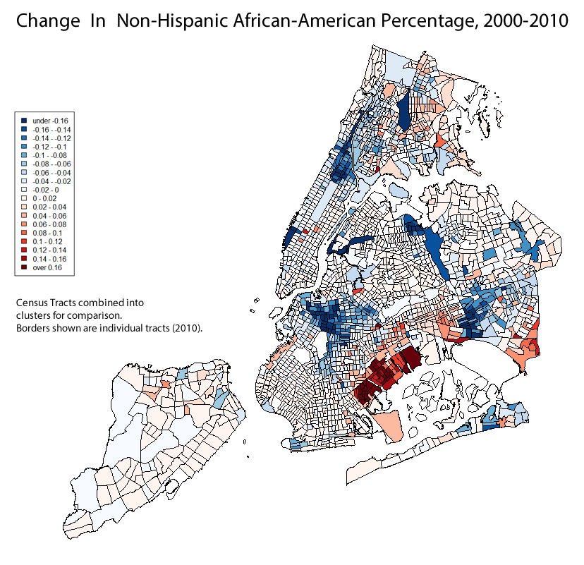
Several areas of New York City had shrinking non-Hispanic white population shares.  It might be tempting to construct a single narrative or explanation to try to explain all of these areas--"this is where minorities are being pushed by gentrification", or whatever.  But the areas are all pretty different.  Some became less white because they became more African-American, others became more Asian, others became more Hispanic.  And the same applies to the areas that became more white.  I'm not sure how much a single story fits.

(You also might have noticed a strip of midtown Manhattan, around Penn Station, that wouldn't fit this narrative either.) 

For example, southeast Brooklyn—Canarsie—saw an increase in African-American population share, while Brooklyn's Prospect Heights, Manhattan's Harlem, and Queens' Rochdale and Jamaica neighborhoods saw decreases.  I don't know how many African-American residents simply moved from Harlem or from Prospect Heights to Canarsie, but I wouldn't discount the effects of people moving to and from New York City altogether.  Indeed, South Jamaica's Wikipedia entry claims that "increasing numbers of Mexican and West Indian immigrants [have moved] into the community in recent decades.


On the other hand, southwest Brooklyn—Bensonhurt and Sunset Park--saw an increase in Asian-American population share, as did Ozone Park and most of northwest Queens.  Very, very few Census tracts had declining Asian-American population shares, and I don't think all of this can be explained by displaced Battery Parkers.


The Bronx, Lindenwood, Woodhaven, and Richmond Hill, Queens, and much of North Shore, Staten Island, north Harlem saw increases in Hispanic percentage share, while Williamsburg and Bushwick saw decreases.  The Bronx's Community District 10--Throgs Neck and so on, along the Eastern edge--was 48.4% non-Hispanic white and 26.6% Hispanic in 2000, and now (or in 2010) it's 34.5% white and 36.6% Hispanic.


Back to the original question: Now that we know which neighborhoods in New York City grew whiter, we can ask which neighborhoods grew wealthier and more educated.  (There might be some oddness with these maps because of "missing" ACS data--it's less comprehensive than the full Census.)

Here is “bachelor's degree-holding New York City”, then and now:


The lines have stayed relatively constant, but there are notably increases, especially in Williamsburg, Astoria, and Harlem.  Looking at the change map provides further evidence:


Harlem, Astoria, Prospect Heights, Gowanus, Red Hook, Williamsburg, East Shore Staten Island, and Riverdale all show marked increases in the percentage of residents over 25 with at least a bachelor's degree.  But again, step back a bit from the map, and Williamsburg/Prospect Heights, Astoria, and Harlem stand out the most, at least to me.  A lot of people claim the South Bronx is gentrifying, or is about to gentrify, and I suppose there are a few tracts that might support that, but I don't think the South Bronx would stand out to me if I wasn't looking for it.

Few areas show marked decrease—again, the county as a whole has become more educated--although "outer" Brooklyn, Queens, and the Bronx (outside of Riverdale) stand out to me.

Finally, let's look at median household income.  The map of New York City's money stayed pretty stable, with Williamsburg perhaps the clearest visual exception:


Unlike the above statistics, median household income can't really be meaningfully compared by aggregating population, but here is the change map for comparable Census tracts, with incomprable Census tracts colored grey.
While not every tract is comparable, enough tracts are comparable in enough neighborhoods that I think you can see the overall trends.  And, once again, Williamsburg and Park Slope stand out, as does midtown Manhattan (some of which, as you recall, is actually less white than it used to be).

Hopefully, I've provided enough information that you can come to your own conclusions.  But here are three of mine:

First, New York City's obviously had a lot of change in the past decade or so.  But in many regards, what hasn't changed is as significant as what has.  The lines of education, ethnicity, and income  have shown little change in many cases.  

Second, Prospect Heights has indeed gotten whiter, Astoria and Harlem have indeed gotten more educated, and Williamsburg and Park Slope have indeed gotten wealthier.  But the Brooklyn neighborhoods, collectively, stand out, and I think the nature and extent of their change really is unique citywide.

Third, there are many other neighborhoods that saw many other interesting changes.  I'm still curious about that stretch of Midtown, for example.
  
One final map:  

A much under-appreciated fact about New York City, I think, is that (according to the ACS) nearly half of New Yorkers aren't speaking English at home. And, like with many other characteristics, there are sharp regional divides that, in many ways, show little change:


Note that, if you were to overlap the “English-Speaking” map with the “non-Hispanic white” map, you would see that relatively few New York City Census tracts are both generally white and generally English-speaking. (Basically, many of the English-speaking neighborhoods are heavily African-American.) The exceptions are lower Manhattan (by which I mean everything south of Harlem, outside of Chinatown), Williamsburg, Park Slope, and Staten Island. Unsurprisingly, these are basically the neighborhoods many white English-speakers (and writers) identify with the city as a whole, with the unsurprising exception of Staten Island. But they are not, to say the least, very representative.