With the same technique—using tract relationship files to combine 2000 and 2010 tracts into comparable units (throwing out currently empty polygons)--we can look at changes across New York City. Have any neighborhoods changed like Brooklyn's Williamsburg/Park Slope nexus? And what other kinds of changes have their been?
(By the way, I found these neighborhood maps of Queens and the Bronx useful, among others.)
Let's begin with race and ethnicity. Unfortunately, New York City is quite segregated, and with de facto racial/ethnic borders that are very close to what they were 10 years ago. For example, the boundary of Chinatown, in lower Manhattan, is almost precisely the same in 2000 and in 2010.
While most areas have seen rather little racial or ethnic change, some areas have of course seen much more. On a map, changing regions stand out all the more for being relatively rare and sharply limited.
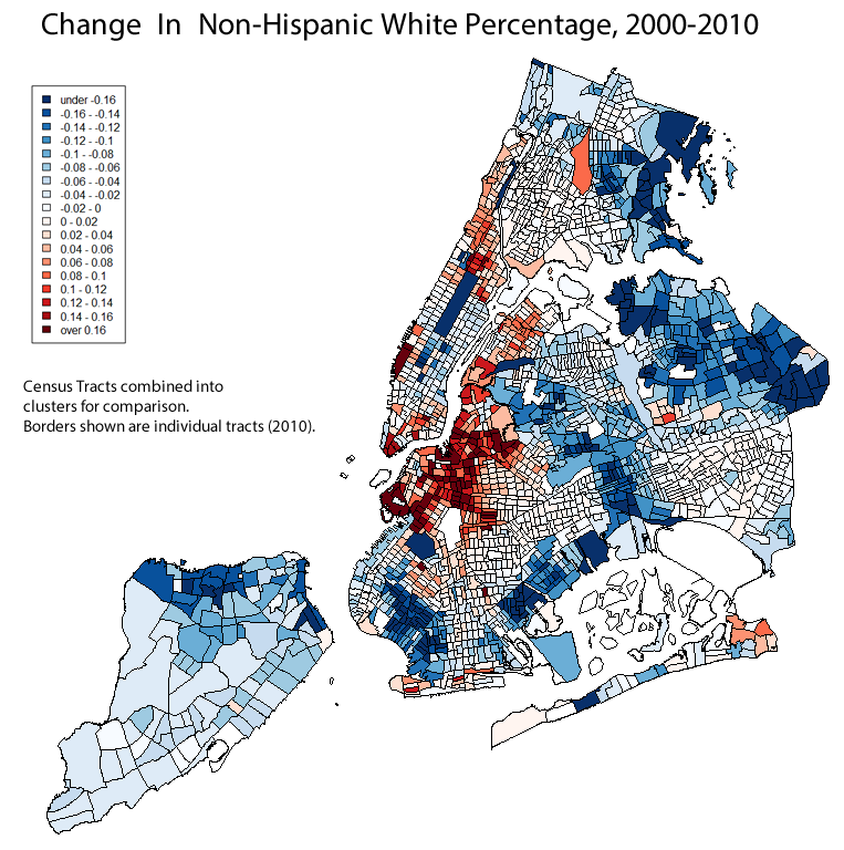
For example, here is a map of the change in
non-Hispanic white population share (“blue” generally means
“decrease”, in these maps):
The non-Hispanic white
population share generally increased the most in that familiar Brooklyn region running from Gowanus through Prospect Heights and Williamsburg to East Bushwick.
There was some increase in Harlem,
especially in South Harlem, in Hudson Yards, and in Battery Park, and what seems to be a smaller increase in Astoria and in Coney Island. But if you step back a bit from the map, then the Prospect Heights area should stand out as the most significant.
Several areas of New York City had shrinking non-Hispanic white population shares. It might be tempting to construct a single narrative or explanation to try to explain all of these areas--"this is where minorities are being pushed by gentrification", or whatever. But the areas are all pretty different. Some became less white because they became more African-American, others became more Asian, others became more Hispanic. And the same applies to the areas that became more white. I'm not sure how much a single story fits.
(You also might have noticed a strip of
midtown Manhattan, around Penn Station, that wouldn't fit this narrative either.)
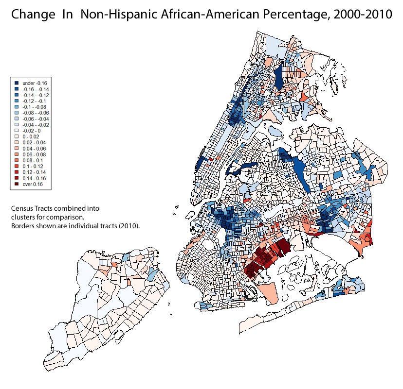
For example, southeast
Brooklyn—Canarsie—saw an increase in African-American population
share, while Brooklyn's Prospect Heights, Manhattan's Harlem, and Queens' Rochdale and Jamaica neighborhoods saw decreases. I don't know how many African-American residents simply moved from Harlem or from Prospect Heights to Canarsie, but I wouldn't discount the effects of people moving to and from New York City altogether. Indeed, South Jamaica's Wikipedia entry claims that "increasing numbers of Mexican and West Indian immigrants [have moved] into the community in recent decades.
On the other hand, southwest
Brooklyn—Bensonhurt and Sunset Park--saw an increase in Asian-American population
share, as did Ozone Park and most of northwest Queens. Very, very few Census tracts had declining Asian-American population shares, and I don't think all of this can be explained by displaced Battery Parkers.
The Bronx, Lindenwood, Woodhaven, and Richmond Hill, Queens,
and much of North Shore, Staten Island, north Harlem saw increases in
Hispanic percentage share, while Williamsburg and Bushwick saw
decreases. The Bronx's Community District 10--Throgs Neck and so on, along the Eastern edge--was 48.4% non-Hispanic white and 26.6% Hispanic in 2000, and now (or in 2010) it's 34.5% white and 36.6% Hispanic.
Back to the original question: Now that we know which neighborhoods in New York City grew whiter, we can ask which neighborhoods grew wealthier and more educated. (There might be some oddness with these maps because of "missing" ACS data--it's less comprehensive than the full Census.)
Here is
“bachelor's degree-holding New York City”, then and now:
The lines have stayed relatively constant, but there are notably increases, especially in Williamsburg, Astoria, and Harlem. Looking at the change map provides further evidence:
Harlem, Astoria, Prospect Heights, Gowanus, Red Hook, Williamsburg, East Shore Staten Island, and Riverdale all show marked increases in the percentage of residents over 25 with at least a bachelor's degree. But again, step back a bit from the map, and Williamsburg/Prospect Heights, Astoria, and Harlem stand out the most, at least to me. A lot of people claim the South Bronx is gentrifying, or is about to gentrify, and I suppose there are a few tracts that might support that, but I don't think the South Bronx would stand out to me if I wasn't looking for it.
Few areas show marked decrease—again, the county as a whole has become more educated--although "outer" Brooklyn, Queens, and the Bronx (outside of Riverdale) stand out to me.
Finally, let's look at median household income. The map of New York City's money stayed pretty stable, with Williamsburg perhaps the clearest visual exception:
Unlike the above statistics, median household income can't really be meaningfully compared by aggregating population, but here is the change map for comparable Census tracts, with incomprable Census tracts colored grey.
While not every tract is comparable, enough tracts are comparable in enough neighborhoods that I think you can see the overall trends. And, once again, Williamsburg and Park Slope stand out, as does midtown Manhattan (some of which, as you recall, is actually less white than it used to be).
Hopefully, I've provided enough information that you can come to your own conclusions. But here are three of mine:
First, New York City's obviously had a lot of change in the past decade or so. But in many regards, what hasn't changed is as significant as what has. The lines of education, ethnicity, and income have shown little change in many cases.
Second, Prospect Heights has indeed gotten whiter, Astoria and Harlem have indeed gotten more educated, and Williamsburg and Park Slope have indeed gotten wealthier. But the Brooklyn neighborhoods, collectively, stand out, and I think the nature and extent of their change really is unique citywide.
Third, there are many other neighborhoods that saw many other interesting changes. I'm still curious about that stretch of Midtown, for example.
One final map:
A much under-appreciated fact about New York City, I think, is that (according to the ACS) nearly half of New Yorkers aren't speaking English at home. And, like with many other characteristics, there are sharp regional divides that, in many ways, show little change:
Note that, if you were to overlap the “English-Speaking” map with the “non-Hispanic white” map, you would see that relatively few New York City Census tracts are both generally white and generally English-speaking. (Basically, many of the English-speaking neighborhoods are heavily African-American.) The exceptions are lower Manhattan (by which I mean everything south of Harlem, outside of Chinatown), Williamsburg, Park Slope, and Staten Island. Unsurprisingly, these are basically the neighborhoods many white English-speakers (and writers) identify with the city as a whole, with the unsurprising exception of Staten Island. But they are not, to say the least, very representative.


No comments:
Post a Comment