I'm not the biggest fan of county-level maps, but I happened to find these Census spreadsheets showing 1959 poverty rates by county (from the 1960 Census). I used these amazing historical county shapefiles from the Newberry Library's Atlas of Historical County Boundaries. Here's the poverty thresholds they're using (a pretty complicated topic), and here's the map:

(For some reason, the spreadsheet has two different entries for tiny Weston County, Wyoming. I just picked the one with the larger population; the other entry would give it a poverty rate of 1.88% out of a population of less than 400.)
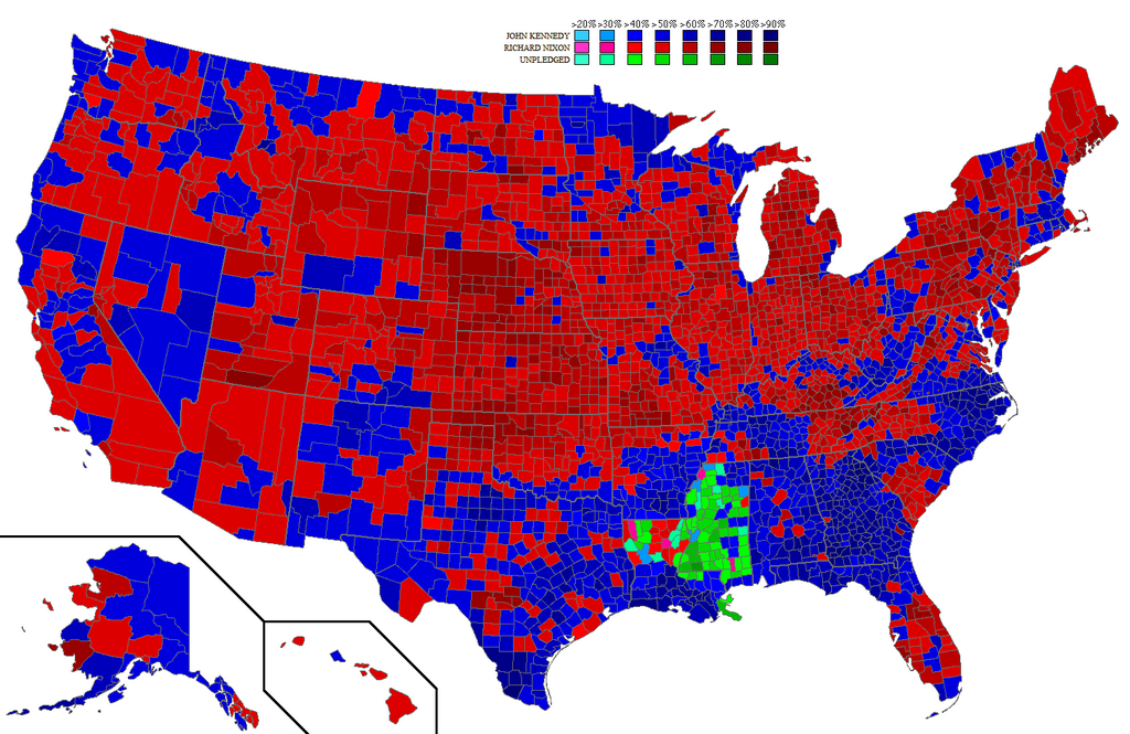
This is more about map-making than demographics, but the South practically requires a different color scale than the rest of the country. The darkest two colors I used correspond to poverty rates of at least 37%. The following states have a majority of their counties in that category: Virginia, Texas, Florida, West Virginia, North Carolina, Kentucky, Louisiana, South Carolina, Tennessee, Georgia, Alabama, Arkansas, and Mississippi. That is, nearly every state that could reasonably be called "Southern" (except Oklahoma and Missouri).
Of course, there's a bias here, as the South also has lots and lots of counties. Of those states, Florida had the lowest statewide poverty rate (28.36%), then comes Oklahoma (29.87%), New Mexico (29.88%), South Dakota (30.1%), and then the rest of the South, with Mississippi's poverty rate the highest, a whopping 54.51%.
Adding to this bias: Many of the most populous (that is, urban) counties in the South had relatively low poverty rates. Looking at the map, you'll see that the counties of Houston, Dallas, Fort Worth, Baton Rouge, New Orleans, Greensboro, Winston-Salem, Charlotte, Miami, Louisville, Memphis, Nashville, Jacksonville, Sarasota, St. Petersburg, Orlando, Jackson, Little Rock, Atlanta, and the Atlanta suburbs all had among the lowest poverty rates in their states. (Although West Texas had pretty low poverty as well.) Same with the counties of Tulsa and Oklahoma City, and with the (arguably less "Southern") Virginia suburbs of D.C.
Probably not coincidentally, many of these relatively low-poverty urban counties were among the first areas of Republican strength in the South. Nixon, for example, carried a few in the 1960 election, and some also elected Republicans to the 1961-1963 House: there was William C. Cramer in the Pinellas/Hillsborough area, Joel Broyhill in what we now call NoVa, Bruce Alger in Dallas County, Page Belcher, whose district included Tulsa County, Charles Jonas, whose district included Mecklenburg County, North Carolina (Charlotte), and, stretching the definition of the "South", Thomas Curtis, in part of St. Louis County. (The other Southern Republicans represented districts closer to Appalachia, traditionally less Democratic, such as Richard Poff in Virginia, Eugene Siler in Southeast Kentucky, and the Reeces and Howard Baker, Sr. in Eastern Tennessee. There was also Durwad Hall, in Southwest Missouri) Democrats had close elections in a few Southern districts that didn't fit this pattern, though.
I don't know whether the cities themselves were lower-poverty, or whether the inner suburbs in those counties outweighed urban poverty. Perhaps both. Richmond City had a relatively high poverty rate of 28.91% (though this was still a bit lower than Virginia's statewide poverty rate of 30.63%), while its inner suburban counties, Henrico and Chesterfield, had far lower poverty rates, 8.04% and 12.66% respectively.
Either way, this was a national pattern. Many of the poorest counties outside of the South were in rural parts of Minnesota, Nebraska, Michigan, and the Dakotas. The poorest counties in California (other than tiny Alpine, and Imperial) were in the Central Valley. The poorest county in Michigan was Lake County, subject of a study of rural poverty a few years later. (The study pointed out that, at the time, Lake County had the second-highest African-American percentage in the state, apparently because of "land promoters...spreading [a] false rumor" about a Ford plant. It also alludes to Lake County having been home to the segregation-era African-American resort at Idlewild.)
Of the 100 largest counties in the country, only 18 had poverty rates above the national rate of 22.1%. Most of these were Southern counties whose poverty rates were probably still lower than their regions'. Here are the 18, with counties outside the South in bold:
1. Bexar County, Texas (34.8%).
2. Shelby County, Tennessee (33.03%).
3. Mobile County, Alabama (32.02%).
4. Orleans Parish, Louisiana (31.29%).
5. Jefferson County, Alabama (30.87%).
6. Fulton County, Georgia (29.17%).
7. Hillsborough County, Florida (27.97%).
8. Duval County, Florida (26.28%).
9. Davidson County, Tennessee (25.93%).
10. St. Louis City, Missouri (24.62%).
11. Pinellas County, Florida (24.54%).
12. Broward County, Florida (24.07%).
13. New York County, New York (24.06%).
14. Fresno County, California (23.93%).
15. Luzerne County, Pennsylvania (23.25%).
16. Baltimore City, Maryland (23.19%).
17. Dade County, Florida (22.29%).
18. District of Columbia (22.22%).
The aggregate poverty rate in the 100 largest counties was only 14.8% (out of a population, at least the population where poverty could be determined, of about 78,000,000, or about 44.7% of the total).
One exception probably stands out for modern readers: New York County, a.k.a. Manhattan.
Manhattan had the highest poverty rate in the Five Boroughs, about five points higher than the runner-up, Kings County, a.k.a. Brooklyn (17.19%). Bronx County had a similar poverty rate (16.6%), and Richmond (Staten Island) and Queens counties both had poverty rates below 10% (9.24% and 8.05%, respectively). Probably a large fraction of Manhattan poverty was concentrated in Harlem.
The list of lowest-poverty counties probably won't surprise any modern readers, except perhaps by how little has changed. The lowest-poverty counties of 1959 are mostly in still-affluent areas of the country, like the suburbs of New York in Long Island, Connecticut, and New Jersey; the suburbs of D.C., the San Francisco Bay Area, Greater Boston, and even the (briefly notorious) suburbs of Milwaukee.
Here is a list of the 25 lowest-poverty counties of 1959:
1. Yellowstone National Park, Montana (0%).
2. Los Alamos County. New Mexico (2.16%).
3. Nassau County, New York (5.29%).
4. Falls Church City, Virginia (5.34%).
5. Bergen County, New Jersey (5.38%).
6. Du Page County, Illinois (5.48%).
7. Mineral County, Montana (6.28%).
8. Montgomery County, Maryland (6.29%).
9. Morris County, New Jersey (6.58%).
10. Arlington County, Virginia (6.68%).
11. Johnson County, Kansas (6.7%).
12. Anoka County, Minnesota (6.79%).
13. Montgomery County, Pennsylvania (6.86%).
14. St. Louis County, Missouri (6.88%).
15. Hinsdale County, Colorado (6.94%).
16. Fairfax County, Virginia (7%).
17. San Mateo County, California (7.02%).
18. Lake County, Ohio (7.21%).
19. Norfolk County, Massachusetts (7.28%).
20. Baltimore County, Maryland (7.29%).
21. Somerset County, New Jersey (7.36%).
22. Union County, New Jersey (7.53%).
23. Middlesex County, Massachusetts (7.68%).
24. Ozaukee County, Wisconsin (7.8%).
25. Waukesha County, Wisconsin (7.9%).
How does this compare to today? As I'm reading now, the definition of the poverty rate has changed over time, especially considered in context of changes in anti-poverty programs:
"We used to measure those who were poor after we’d helped them. Now, by and large, we’re measuring who would be poor if we didn’t help them. These just aren’t the same thing and so the numbers are not directly comparable."
As another friend pointed out, this might effect some areas more than others. As that article says, you can't really make direct comparisons, but I think relative comparisons (these two places used to have similar poverty rates under the 1960 definition, what are their poverty rates now?) remain somewhat interesting.
Because I'm not exactly sure how the definition of the poverty rate has changed over the past half-century, rather than include a map of current poverty rates by county, I'll include this scatterplot of past and present (or 2007-2011) poverty rates for counties with the same FIPS code as in 1960 (plus Miami-Dade).
I don't know if these all have the exact same boundaries, but since Miami-Dade changed its FIPS code when all they did was change the county's name, they should. A few counties have changed their boundaries since the 1960 numbers (know where Ormsby County is)?

Hm, that's a lot. Let's limit ourselves to just counties large enough to have 1-year estimates.

Still pretty hard to read--how about the 350 largest of those?
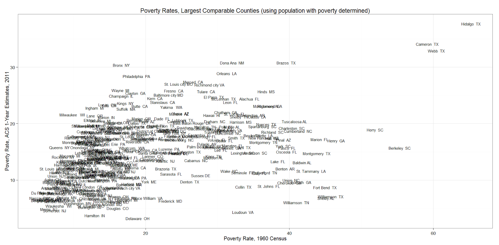
What stands out? Some counties weren't especially high-poverty in 1960, but are especially high-poverty now: Wayne and Ingham Counties, Michigan; The Bronx and Brooklyn in New York; Clayton County, Georgia; Suffolk County, Massachusetts; Lucas and Lane Counties, Ohio; Champaign County, Illinois; Butte County, California, etc.
(To paraphrase my friend jncca, the correlation with changing racial demographics must be considerable.)
On the other hand, several counties are especially low-poverty now, but weren't in 1959: Loudon County, Virginia; Williamson, Collin, Fort Bend, and Denton Counties, Texas; Cherokee County, Georgia; Union County, North Carolina; Frederick County, Maryland; Seminole, Clay and Sarasota Counties, Florida; Rutherford County, Tennnessee, etc; Shelby County, Alabama; Forsyth County, Georgia, etc.
Three Texas counties on the Mexico border, Hidalgo, Cameron, and Webb, were and remain the poorest of this group of large counties.
If you have any sense of how any of this has more to do with the definition of the poverty rate than with poverty itself, let me know.
St. Louis is not a southern city, it's a northern industrial city. People say soda, when they mean soda. Not "Coke." :)
ReplyDelete